Showing posts with label unit 45. Show all posts
Showing posts with label unit 45. Show all posts
Thursday, 7 April 2016
notice
" I certify that the work submitted for this assignment is my own. I have clearly referenced any sources used in the work. I understand that false declaration is a form of malpractice. "
He's phoning around this is just incase he doesn't get to you xx

Monday, 28 March 2016
poster idea 5

For.my more free roam idea I really wanted to make my own.version of this poster (which had no notable artists attached but all I could comment on this was that it was a mixture of different paintings which I set to recreate myself.For this idea I used the below images (which were taken with my own.phone came a while out:


These photo felt diffrent in colours and I'm schemes which helped to bring the idea to life.Some images had been.highly editor's using Photoshop while others had minimum changes (except the usual like colour levels and brightness)
I wanted to put a drawing on the top layer to give it my own style(and so it wouldn't look like a cop out of te orginal image.here is.the image I made via Adobe illustrator:


Original sketch drawn by hand. Before adding detail:

I had drawn this out before hand in different ways that can.be seen.bellow:

For a final note here is a close up of the England flag that was put onto all my work and the tag lime that related to the Art and design industry:
I feel.like this idea expresses the many different media's that is used in the creativity (computer images camra images and hand drawn images).
Monday, 21 March 2016
poster 4 drawing idea


While looking for a idea for my hand drawn idea i stumbled across these circular ideas.With a mixture of thick and thin lines and a circular base i automatically loved the idea.I wanted to include really simple things in this first idea so got to work on creating some images.
i used these brushes as a example for my drawings:


A beginning for my final piece featuring a heat that i drew in a simple form.This then gave me the idea to add detail and shading.I felt it was best to experiment.
As you can read from my notes i plan to make the font on my work red.

My final idea minus the union jack in the corner and the actual fonts.
There is a page explaining my choice of fonts.
For my poster i researched into fonts(using Dafont)I came up with a few using my tag line:"The heart of art is beating"
here are some of my ideas:


i like the bottom one more because i feel that it is bolder and brighter and stands out.I would have to do it in white as well as my background is black.I will be using this slide as a reference for creating my final font.

Since last writing my idea has evolved with the poster now supportingly tag line of text.
so far i am very Impressed with this idea and how it has turned out.Even the slight smuges on the paper add to the poster.
I have yet to put the appropriate British flag and said information in the bottom but that is my next task:
My idea for thundering was that the heart represented the art industry and the way it would grow the brushes are a obvious artistic touch that would be used in said industry.
This idea was made as more of a obvious idea.
Tuesday, 15 March 2016
Poster 3 work and inspiration (ideas that didn't work)
Idea taken from the back of a Playboy magazine a advertising a beer called Schmitz.I found this good because pf the slanted compass.Its catchy slogan also drew me to the idea as well.With my design i wanted to use these clever ideas so set out to make a similar idea.


(c) Jos. Schlitz brewing co. milawaukee and other great citizen.

Here is the start of my first idea using this method.I feel like i should make the font bigger and i will be taking a macro lens shoot as well of a real person. Prehaphs i shall take a picture of someone holding a paint brush from that similar angle.
I have now added a slight grainy effect to the page to make it look a little older and more worn.I feel it adds a little and doesn't make the page look as crisp.

A screen shoot of said image above.
For my font i went for the idea of using a font(from daft) called Loki cola.This highly and most obviously resembles coca cola and has a very old and swerve font which goes well with my idea(almost matching the font found on the poster).
Below is a quick screen shot of said font and a link to the font in intend to use:
http://www.dafont.com/loki-cola.font?text=%93UK+creative+industries+generate+%A384.1bn++a+year+to+the+UK+economy%94

other designs that didn't make the cut;

Tuesday, 8 March 2016
focal points in art and design idea(continuing on poster 2)
Before starting the project we were given the advice to look up posters or ideas with key vocal (or focusing points) the below images were some I used to help me:

More of my attention was attracted to this one as I felt it was by far the simplest and eye catching idea.It also gave me inspiration for using shapes in my work (mainly the circular dea)

This idea was found as well but I thought it would be good to put this to work in future ideas.I really liked the whole change of textures and images throughout the picture and the simplistic arrows pointing to the earth.
Before starting my idea i wanted to make a figure that would not be identified as a male nor female.Thought this i created a simple human shape that i felt fit with my idea. None of these would attract attention other then the red one.Here is my final(and very simple)idea:

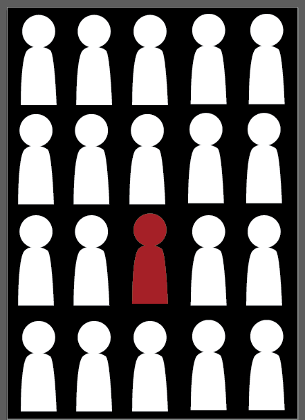
A simple idea using the concept of vocal point(which should really be in all my work)but this in particular extends on. By making all of the people white and then one red i feel it attracts the eye and catch i looker.
Here i did a more detailed picture with a lot more people included:

I feel as if this one is a lot more detailed and has more structure then the other one.
At the bottom you can see the flag and information about the art and design industry on my work that we researched into:
Monday, 7 March 2016
poster 2 progress and final ideas.

I feel that this idea really speaks for its self in tearms of its meaning but I found.it to be quite amusing and incredibly relaxing to make.I feel the shapes I made are accurate to blinds and bring my message across quickly and effectively.This design was made quite quickly using Adobe illustrator.I feel that,for my computer generated image,this is good.
The Font used had to be quite small so it would not be to demonstrative and bold.I went few quite a few but found the thinner font went the best and would make the reader look into the blinds themselves (thus attracting more attention) below is a closer up of the font:

Using two ideas of the pictures being blinding and the words being in blinds i thought this was a good idea brought up by a fellow student.I used a quick reference of a shape from google images(not that it was that hard to recreate blinds) but it looks good in the end.
With a fact about the art industry on the bottom blind and the union Jack (which was made black and white as not to crash with the rest of the design):

This idea really was more of a nod to the vocal point idea then art and design itself buy it could be noted that everything around is has been designed and molded by the artistically of the past and present.
Poster 1 progress

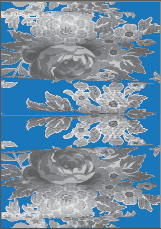
The starting texture taken from a fabric in a near by art shop window.A flowery image.

The starting picture taken for my idea.
(Kindly modelled by a classmate)

Then the chosen background colour was added
First finished idea using artist and video shown below:
The face was very simply overplayed with the texture and the needed hair was rubbed out to make the image a little smoother.This image had to steps to it but i didn't know if going without the background would make it to simple.As you can see drips were added to give the image a pealed or paint effect.
Here is the final image with the union Jack and Art and design font on the bottom:


*Artist fly dye;she's bad taken from a music video
i could not find a direct link to the artist but found other images from the music video


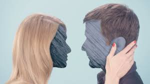
this artist automatically struck me as good because i loved the simplicity.
i want to continue making other posters with this style.
I feel like it is obvious that this was my most worked on and favorite image without a doubt and would have loved to do a full series of these styles (but having to do one by hand became a little more challenging)
Monday, 1 February 2016
19th century satirical illustrations
http://www.oxfordartonline.com/public/page/benz/themes/BritishSatire
The link above provides information into the 19th century satirical illustrations.Below are some examples of what one actually is:


The link above provides information into the 19th century satirical illustrations.Below are some examples of what one actually is:


Something i find very strange about theses images are the way faces and heads are proportioned and the illustrations are made.The last one looks like it could possibly be a options poster or chart.
Mixed media and fine art ideas (ones to consider)
here is some research i have done for Unit 45 Graphic image making i will be putting the work i have found into good use.Here are some of the examples i have found:
Most of these are made from magazines and are a mixture of paper and computer(i would assume photoshop)
Fine art:

Hand painted:


Photography and hand drawn imagery:
I feel as if this image would be very easy to recreate with a good camera and smooth graphic lines.I really love the simplicity as well.I feel as if this one is defiantly one to consider.
 Hand drawn images with text in the back:
A idea brought to the class by our tutor today.Using facts about the art industry we could make a image that has a list at the back and compose something that relates to the art industry at the front.A simple but still very effective idea that should be taken into consideration.

 Texture photo(stitched):
This image really struck me as i different approach to making posters.The idea that you could do a series of three poster that had been hand stitched and then had splashes of painted added really would given the a unique feel.While i am the first to admit i know very little about textiles andbcan not stitch i would love to have a go at creating something like this.

Most of these are made from magazines and are a mixture of paper and computer(i would assume photoshop)
Fine art:

This one automatically struck me and the bright colours really go well with the idea(fashion and modelling).I really love the fact the image looks hand drawn and i want to take inspiration from this image in some way.A mixture of patterns and dots really makes this work intrersting.

This one takes a totally different approach to the last one.I feel as though this one looks a lot more realistic and the painting makes it look smoother.I love the way the dress is made out of comics to look like what she is wearing.
Mixture of photo and simple:
This one is a prime example of mixed media and uses photos take and special effects (i would assume on photoshop etc)to create a faded picture.While i ,myself, would most likely not use this idea in my work i would like to still consider it as a option if i were to use the camera more.
I feel as if this image would be very easy to recreate with a good camera and smooth graphic lines.I really love the simplicity as well.I feel as if this one is defiantly one to consider.

A idea brought to the class by our tutor today.Using facts about the art industry we could make a image that has a list at the back and compose something that relates to the art industry at the front.A simple but still very effective idea that should be taken into consideration.

collage photo:
Now this is a image i do really like.I love the way that multiple images have been combined into one to make not only a person,but a recognisable one at that.The colours all fit right and the background makes the image look even better(without it looking as messy and busy like the first image).
I love that the texture on the face isn't even a image so really does give this picture a bit of uniqueness.

This image really struck me as i different approach to making posters.The idea that you could do a series of three poster that had been hand stitched and then had splashes of painted added really would given the a unique feel.While i am the first to admit i know very little about textiles andbcan not stitch i would love to have a go at creating something like this.

Subscribe to:
Posts (Atom)