Showing posts with label unit34. Show all posts

Tuesday, 29 September 2015

Original brief-For my FMP/Starting work

Original Fmp ideas:
For my FMP project I have decided to try make us less cutlery (elements of shindogu have been inculded)most of my sketch work is in my folder but I have a example of one of the test cups I have made:
With this pot I included uneven textures and bumps.This would make it almost impossible for some one to use this cup as all the liquid would spill out of one of the sides. This is,of course, not even close to my final design but is still a idea. I shall be waiting till I am able to paint it.My thoughts are that if I use acrylic paint I can then paint over the pot in horrible,murky colours.This will add to the piece and make it so that no one would even want to pick it up.
Some close ups of my first idea:

A close up of the top part
*please note that on my past drawings of this idea I have measurements on how big my piece should be.This is only a example and most likely will be bigger.


Monday, 6 July 2015

Template ideas for Worksop bus station


Designs made using adobe illustrater:


Ideas that have been imported onto the wall that we will be decorating.


The design above is my favourite one.


Wednesday, 1 July 2015

final design for wall (unit 34)

Evaluation:
This is my final idea for the wall.This was made using illustrater and using lines and the pen tool.
The idea of this design is that all the people are part of a jigsaw and that they all connect together(as a jigsaw does).I have tried to add as many people as i could so that it would make the work unique as possible.Each person has a different style(just like in real life).I at first thought about adding hair to each person but this would mean that the idea would not fit together(literally).
I also tried to vary the colours of each outfit as much as i could.I really wanted yo avoid the clique of adding different skin colours.I feel that some times it comes a cross as obvious that different skin colours and races are added so that a person will not be criticised.
I generally enjoyed this unit a bit more then others.Maybe because i had more ideas from the start.


here is a close up of some of the design.This focus on a few people.

Clients view:


Tuesday, 30 June 2015

sketches for final idea

here are my sketches i did for my final bus design.I am extremely impeded with the sketches i produced.


different concept ideas i thought of with some notes.My idea of jigsaws was brought to light here.
Here we see my final layout idea which i will using in my work.

Monday, 29 June 2015

Splatter work(commission)

Clients preferred colour: Orange/Yellow/white (slight grey)
Canvas:Large
Deadline:End of next week

Research Splat paintings
Artists:
Paul Jackson Pollock (January 28, 1912 – August 11, 1956), known professionally as Jackson Pollock, was an influential American painter and a major figure in the abstract expressionist movement. He was well known for his unique style of drip painting.

During his lifetime, Pollock enjoyed considerable fame and notoriety; he was a major artist of his generation. Regarded as reclusive, he had a volatile personality, and struggled with alcoholism for most of his life. In 1945, he married the artist Lee Krasner, who became an important influence on his career and on his legacy.
*Basic information taken from Wikapedia.


Bus station wall art

my first design that includes the circular feature is this one.It includes two people who are going down a whirlwind together.This could suggest that time in Worksop goes so fast that you feel like you are being sucked away.I like the colour effect this image has.All the red gradually starts to fade as it goes on which i think is nice.
This design uses the same idea as the first.Though the colour idea is similar i still prefer the first one.
With this one i thought of the idea that the people would be falling down instead of sideways.
The characters on both of these designs were used on my square designs before hand.
This is another design that i chose to work on. This one is a little different to the others as i have not used the spiral idea.I did how ever include the people like i did last time.
This is a more updated version then the last one with texted added to (this text is small for the sole purpose of not taking up room and not being too bold).The text its self reads "
I thought that it would relate my work to the bus stop a little more.


Wednesday, 24 June 2015

Keith Haring(supporting Bus shelter wall work)

For Unit 34 my first thoughts were to use Keith harings work to influence my own.I have always like his style and thought i could make it my own in some way.Below are some examples of the work he has done which i have studied:
The picture seen above is my favourite that h has done.I love the range of characters on show in this image. Theres a range of animals and humans(all different colours etc).He manages to make some images quite funny was well which is a bonus.
This design in particular has influenced my work the greatist. The colours are the same as mine( i did not do this intentionally though).
Keith also did black and white images that looked just as good as the work that had colour.
A little information about Keith Haring himself:
Keith Allen Haring (May 4, 1958 – February 16, 1990) was an American artist and social activist whose work responded to the New York City street culture of the 1980s by expressing concepts of birth, death, sexuality, and war. Haring's work was often heavily political and his imagery has become a widely recognized visual language of the 20th century.
*The information above has been taken from Wikipedia and to my knowledge is true.


Monday, 22 June 2015

Bus station wall of art ideas

For the bus stain project we were congratulated on our work(this circular shapes that we did for the windows).We were now given the opportunity to make a wall of our Art for the outside areas.At the moment we are working on making this wall with all the other students in the first year.This will include all our previous art work.
First i set up the page 20cm by 6 cm:
*As seen above


We were advised to search 1980s high art so that we could study the pattens and shapes:
I then photo shopped a hand using the fill button so that it would have a nice sillioute to it
this is what it looked like:


This is the start of my design after i added hands to my work.Each have diffrent colours to give them variety.Of course this is not the finished piece and the back ground still needs some work(some interesting colours to add vibrancy.
Sine this design did not have the vibrancy and would not have caught anyones eye.
There was also a lot of empty space in-between.
For my other art wall design i will be using the artist that i chose earlier .Please see the post i made about Keith Haring for more information on his work.
here is the work so far:
All i need to work on now is the actual background its self. The first piece of wall art has been done.And vaguely uses Keith Harings style in the way that he adds multiple people in his work.
This is the beginning of my new design.This one was also based on Keith Haring.I used the idea of people but didn't include the roundness that he uses.
This is my final picture for my wall art.As you can see, i have added multiple colours to my work.This represents that we welcome all diffrent colours and ethnicity's.As you may be able to see,they are not normal skin colours so that it doesn't offend anyone.


Wednesday, 17 June 2015

Final Hoax idea

My final idea for Unit 34 is to make a blob like creature(that looks like a substance similar to Tar or what would be used on roads).I would put this creature in photos around Worksop.I will be choosing the actual place later on but my main aim is to make the creature.
To find the blob shape i was after i looked up 'Black blob' on Google search and found the picture that suited I'm needs.
This picture worked out for me becuase it has a very melted effect that i can use to my advantage.
The quality of this picture is quite high so its easier to photoshop


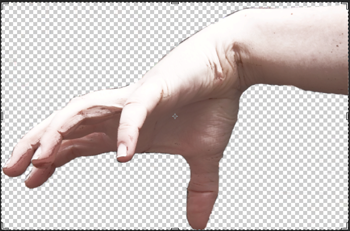
The hand i will be using to combine with my black blob is one that i took with a class mate who posed her hands in various positions until i found the one that suited.
This is the image before i started to edit it.
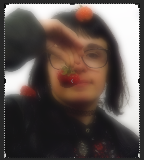
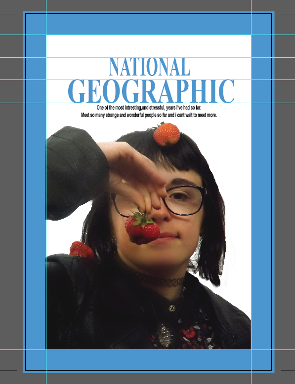
This is the image after i photo-shopped it.I used effects i had learnt from our National Geographical unit that we had completed the other day.
I used colour balance,saturation,and other small effects to get the small washed out hand effect i wanted.By doing this it also gave the image a nice shadow so this was a bonus.

I then combined the two images together and starred to add hands to my blob monster.I used blur to connect the hands to the body.This made it look a lot more convincing then just attaching the arm.
I shall carry on adding more hands(I am considering taking some from different positons as to add a bit more of a challenge into my work.
The hand positioning looks quite silly to me and i really like it.

This is the eye that i edited in photo shop.I shortened the eyelashs as the stuck out and made the picture look uneven.The eye will be put into one of the blob folds of my monster.I am contentplating adding multiple ones.
on this picture i have added the eye i edited.I merged the eye in with part of the blob is it looked a little less edited on.i really think this image is starting to come along nicely.


Monday, 15 June 2015

National Geographic poster

Below is the process I went through to make my geographic magazine front cover. We were taught how to smooth images to make them more'  appealing' 


This was my end result. There would have been a few changes to my poster if I had had enough time but my finished piece was not so bad.