Showing posts with label Unit 50. Show all posts
Showing posts with label Unit 50. Show all posts
Thursday, 7 April 2016
notice
" I certify that the work submitted for this assignment is my own. I have clearly referenced any sources used in the work. I understand that false declaration is a form of malpractice. "
He's phoning around this is just incase he doesn't get to you xx
Monday, 11 January 2016
Notes from presentation and general evaluation on work
My presentation
After i had done my presentation i felt that i had done well (not quite as well as i did in my last presentation).I felt though that my evolution was good(but better on my actual blog) and that by adding pictures taken from my sketch book.It gave people a better idea of what i had started with before hand.
Overall i feel as in my lack of love for this unit showed in my presentation and that it could have been longer.But on the other hand the fact it was shorter could have benefited me as peoples concentration would have been held for longer.
Poster:
My poster was by far the one i enjoyed doing the most.I found it fun to play around with layout formats.The research i put towards my poster payed off as i got it exactly how i wanted it.
Overall i hope to get top marks on this.
Billboard:
My billboard was one i didn't enjoy as much.Even though i tried to make many different ones,very few made me feel like they represented my product.I had to make a very unexpected change to my final one as the colours i had put on it were to bright and i would not be able to use them on main roads(this would have caused crashes as they were very bright and eye catching).Overall i wasn't that optimistic at the thought of doing a billboard(because of the size and angles i would have to set it up at)but it turned out okay.
Box design:
My box design was a lot harder then any other tasks in Unit 50.I had put more research into finding the right box net and style for the box then anything else(though this started the ideas for my advertisements so in a way it was very much needed)After experimenting with several different box designs i am quite contented with mine(though i wish i could have changed the 60s high end bright patterns).Generally my box was okay besides struggling with what to put in the background(though after some researching and experimenting it went a lot better).
POS:
My point of sale was quite easy as i already had in mind what i would do.I looked around stores like Tesco's and sainsbury's and quickly found insperation.I made my own shelf and box containers out of paper and used them in the presentation.I ,of course, constructed the box holder before hand.
Infer graphics:
MY infer graphics was my instructions and was hand drawn and them edited in photoshop.This was quite easy and only took a hour or so to sort out.Overall there not much to say other then i am glad i drew it out and edited it as i feel any other way would have taken longer.Also i felt my instructions were perfect for my product (with the paw prints and all).
Wednesday, 9 December 2015
For my infergraphics I wanted to make them in a style that would be easy and fluid. For this I decided to use one of the cutest and simple features which for.me is the paw pads.
I used a example of a paw pad that I found online which is this:
This then helped me to get a idea of the size and how much of my instructions I could put inside on paw pad.My finalist des for my infergraphics is very simple but and use bold lines I plan on making the inside pictures bolder so they will go with the back ground.
This is my start to the infer graphics and the instructions.I have hand drawn them out and will be working on them in Photoshop and illustrator.The actual instructions are quite simple.
1)First take you Proud pets product
2)Open the container
3)Apply to the your Proud pet

 The update to my work;
Here is my final infergraphic coloured up in black and applied to my back ground box:

I am very impressed with how it has turned out in the end and how much better the paw prints look in black as well.The images i hand drew came out a lot better then i thought.
The writing also came out quite well and i feel that my instructions are very easy to understand and follow.
I used a example of a paw pad that I found online which is this:
This then helped me to get a idea of the size and how much of my instructions I could put inside on paw pad.My finalist des for my infergraphics is very simple but and use bold lines I plan on making the inside pictures bolder so they will go with the back ground.
This is my start to the infer graphics and the instructions.I have hand drawn them out and will be working on them in Photoshop and illustrator.The actual instructions are quite simple.
1)First take you Proud pets product
2)Open the container
3)Apply to the your Proud pet

 The update to my work;
I am very impressed with how it has turned out in the end and how much better the paw prints look in black as well.The images i hand drew came out a lot better then i thought.
The writing also came out quite well and i feel that my instructions are very easy to understand and follow.
point of sale idea
 |
| Great advertising found in Sainsbury's that also had paw prints leading to the shelfs.I have taken the idea of the cat on the top and adapted it. |
For my unit 50 I wanted to make my point of sail(which I want to be a stand in some way).
My idea is to make a sign with a cat at t he top.like the one I spotted in Sainsburys yesterday. There would be slots to hold my products in.
I shall be making a drawing below:
 |
| My hand drawn idea of one of my p.o.s |
My boxes stacked how they would be on the shelf (opposed to how they would look on the case i made:
Monday, 7 December 2015
Final work


Here are some of our happy customers(pictures taken by class mates and myself)
Billboards and advertisements: using the same idea as the poster but in a bus shelter format this is also very catchy and will attract people.

For the inspiration of my ad shelter i researched others as influences for example;

I used this photo mostly(and others to try achieve the border advert i was after).While searching i was unable to find pet averts as a example.Having a box (or in my case a cat) was the midpoint of the design.
Done using Adobe Photoshop and illustrator.
Poster:Using illustrator and includes company slogan and catchy colours to hook people in.

Original idea that was sketched out and coloured up.
Shows a diffrent composition.


The cat on the picture was worked on through illustrator.
Billboard:

To begin with i just used the same colour back ground as what was on my poster.Nothing matched and the white font looked horrible.
Taken from This idea below(using right hand border show product in a simple way):
For my billboard layout i found the perfect cat poster:

I took a lot of layout influence from this picture.The borders and the placements as well.Even the placement of the title is in a similar speech bubble.

My practice stetchs before my final work were these:

My original sketches for my logo(using the infludence ).


Above is the company logo that has been turned white for the poster(easily recognisable) and is detachable as well.
Logo for my company (detachable)Also comes in white (which is used for the billboard).

Infer-graphics used for box (Which have been drawn up by hand and drawing in illustrator)
Simple and easy to understand with wording that all can get:


Sketches of my infergraphics and what i planned to do.
Final box design including logo,window so product can be seen,cruelty free and fair trade logo along with recyclable logo and barcode.product relates to my other methods of advertising.My products bright colours and vibrant design would make it a eye catcher while on the shelf:
The box's background and the reason i choose it:
Using illustrator i created this psychedelic 60s high end art(i used the below picture as a big inspiration:

This artwork by Laura Gentians is one of the biggest inspirations to my artwork.I loved the way the multicolour drips splatter down the page.This for me is a extremely eye catching piece that i wanted to re create in some way.Here was the back ground of my box(And also what i started with before i decided my other parts)

My interpretation is different of course but i still kept the drips.I took out the blue as it didn't go with the psychedelic style.The background to my picture is black(but only showed up on my box).
The box's final net:
My first idea was to have the boxes in different fur types(as my products are for different lengths)

The first attempt tempt really boring and generally lacked in drawing anyone in,in any way.

 For short fur(product name)
For long fur

Logos used for my box include the Vegan symbol,recyclable symbol and the use by date;
POS(Point of sale):It will be stopping ked up on the shelf as such to ensure the product is professionally placed:

This would be the stand for my products.
I think this is a great way to advertise.my products as I feel t is very eye catching.
The stand it's self was inspired from one I saw at Sainsbury that was advertising a cat book.


The above is my box made up. My hands are around the box to make sure it stands u straight as the box is very thin due to the paper.If I made the box again I would make it on . I will now be try to stack the paper up. The shape of my box is simple and effective and is easy to stack.
This is the way my products would be stocked in shops:


I drew out the very simple holder and of my products inside. Each holder has all the diffrent types of product that will be sold.
A extra I made Was the idea to give out my product(or advertise more or less).


Monday, 23 November 2015
changes to box design using 60s high end psychedelic art
A massive change to my box layout is the back ground style.I decided to go with brighter colours as it makes my design more interesting and a lot more catchy.By making this change it helps me make my advertisments. Some art work i plan to take inspiration from is pictures like this;


I really like the minimalistic but still full art work that has been made here.


I have already made my leaflet in this kind of style and can easily make my billboard this way as well.
My biggest inspiration and what i plan to make my box to represent is the below picture:

This picture was done by Laura Gentians is one of the biggest inspirations to my artwork.I loved the way the multicolour drips splatter down the page.
here is my rendition of this idea and what i plan to use on my box and other ideas:

This is a lot bigger version of the last design and a more simple one as well.
Monday, 2 November 2015
billboard and advertisements
Below is just a place holder as i will be taking a picture;
(i will be taking one)

I will also be doing a bus stop advert and a small magazine one as well just so i have a bigger range to play with.


 illustrations idea using simple pen on one colour(psycoldelic idea)


 Advert used as example.
Reference i will be using for my billboard


Billboard idea with border.

Cat billboard idea using simple cat

NO GOOD!
Final poster ideas and example i will work from:

ideas for the content including simple style


using simple cartoons(my style).
Pre poster and possible advertisement layout using my sketchy I did earlier and pack pens.
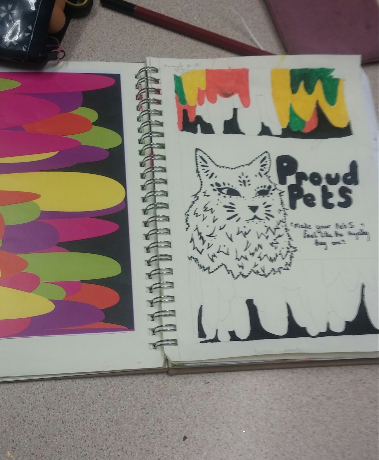
the page on the left gives a more accurate showing of what I want to achieve but the right gives the particular layout.The fonts are a. little off though as they have been hand drawn and I am still working on drawing my actually product over the coloured parts.
Over all this is a good design and I feel that it is stronger then.my last ones. I will keep on working on this design either way.
Here is the computer version I hope to complete asap:

My next job with this would be to add the cat and small writing(which i have forgot).
I really like how this has turned out especially since i turned the pattern around.

Cat details for both poster and board;

With this one i have added thick lines to define the cat more.I have removed the details on the head and have instead added details on the chest.
Maybe i will make the lines a little less bold and put a few features back on.
i feel that this one is a lot better with the changes i made;


Further advertising (billboard)
using the high end drip effect and other resources i have drawn up in my sketch pad:
Black outline of my product that i used to go in the back ground.Blends in the right amount as well.
as seen below is the start of my new design:
(1)

(2)

This (those may) will be the back ground to my billboard thats includes my products in the back ground.
I have yet to add a cat to the design but my idea is to have it with thicker lines and have it bolder then the back ground.I have a few sketches in my book that i can work from.


I took a totally different approach to my billboard idea with a big bold font and several other changes.

update and changes to idea;


Idea without the right handsome border making it feel less inclusive of the space.
 Advert used as example.
Subscribe to:
Posts (Atom)