Tuesday 25 November 2014

Sculpture work continued

Yanboru Boiken Mask: East sepik province,Papua New Guine
,19th Century and before.

I thought I could try link my sculpting work with these creative masks. I feel that the fact they relate to the animal I am using will help

Barbra Hepworth. Pt,1


Monday 24 November 2014

Art deco

 Art Deco is an influential visual arts design style that first appeared in France after World War I and began flourishing internationally in the 1920s, 1930s and 1940s before its popularity waned after World War II.[1] It is an eclectic style that combines traditional craft motifs with Machine Age imagery and materials. The style is often characterized by rich colours, bold geometric shapes and lavish ornamentation. (Taken from Wikipedia)
Vogue magazine front.I really like this picture simply because of the elegance behind it. The way the woman holds the mirror does appear to be very' vogue' .I also like the slight colour fade throughout all the picture. And both blues go well together. 


poster Art deco themed.This picture personally made me think of Futurism and what futurists were trying to achieve with their pictures and ideas(futuristic goals like machines) 
I will most likely be using the ideas of having buildings in the back ground,foreground,e.g...


Art deco paper craft.
Although I would not know how to incorporate paper craft into my work I still like the way this piece has been put together. Using paper and crafted roses seems like a smart idea.

As seen above are some examples of art deco. These pictures give off a 1930 vibe. 

Worksop bus shelter update

Today we met with the project manger for the Worksop bus station build. He hinted that it would be a 1930 theme(art deco style).He very much insisted that it look as professional as possible. Other factors we were told to consider were how detailed we made the final design. If it was too complicated there may be problems printing it out. Simplifying ideas is a option if the final idea becomes a problem. Another thing he said was that he only wanted small areas fully optic as he wanted peoples view to not be blocked
We did not get any implications as to what colour of the piece would be but he may have preferred but he said he didn't want them to be to bright. He kept stressing that he didn't want to but any parameters on what we could and couldn't do on the work.
I have now got a better idea of what to do in my final design but I will have to wait until I find out what the colour of the integer will be before I decide the colour of the outside.

Thursday 20 November 2014

Phillip Jackson (sculpture)


(Taken from Google)
while searching for more sculptures I came upon Peter Jackson 
Who won the National peace sculpture.
I found these sculpture very intresting and I love the way the full body is shown.

Wednesday 19 November 2014

Henry Moore (Sculpture)

best known for his semi-abstract monumental bronze sculptures which are located around the world as public works of art.

His forms are usually abstractions of the human figure, typically depicting mother-and-child or reclining figures. Moore's works are usually suggestive of the female body, apart from a phase in the 1950s when he sculpted family groups. His forms are generally pierced or contain hollow spaces.
(Taken from Wikipedia)
Here I have selected a few of his most well knows pieces:


When doing my sculpture work I will consider the body shapes and the way he portrays the female body.

Worksop Bus shelter (wall murals)


As I was researching into how I could present my work I came upon Art murals
Some of which showed a great splash of colour.While others used simple black and white.
I hope that in the future we will be able to use colour in our work as this help me in the progression of my work. Here are some examples of art murals:


These would be the more classic ones like this:


We're made in the ancient times to depict God's and goddesses of the times.


Model and sculpture work pt.3

This is one of the guides I used to develop my sculpture. I have decided to switch from my Fruit face idea, to something I could develop. This is still going on the idea that fruit is good for your body . I have decided to decorate the horns with fruit (which I will make out of clay) while the body and face is made out of Mod rock and chicken wire.
I have included in my research some horn texture ideas that I hope will help me in the future.
Plus at the bottom right I have found a skeleton structure that may come in handy.
Here is a basic sketch of my idea:

I have already made the base and my next step is to begin to add detail. I will leave painting the model till the very last as I do not want to ruin it. T
Through out this course I have to remember to wear safety gear (Goggles,gloves,Etc..)
As working with Chicken wire sometimes results in having scratches and nicks.

Friday 14 November 2014

modeling and sculpting Pt.2

I researched diffrent face shapes for my work
Female:
I liked this picture because of the way it shows the shape of the face through triangles.
With this guide you could easily construct a face.

This guide helps me with both drawing and sculpting.
Also I wanted to find diffrent skin texture e.g older skin with blemishes 
And a younger less blemishes face type
I feel these will help me to get the shape and texture of my work in the future.


Peter Strain

I have continued to research into a artist called Peter Strain. His art always amazes me because of the way the fonts are so dramatic and how well they fit in with the pictures as well. His seem to always theme his work on Movies of the past some include:
Black Swan .a dramatic set out that uses the fonts as part of the ladies dress.
I like that the text makes up her dress and that part of the text is red(so this helps distinguish parts of her dress).
Breaking bad. The way trees and follidge are included in this picture give it such a classic and beautiful look.
And one of my personal favourites, that was featured in the magazine Guide (The Guardian)
Using the faces of both The Joker and Hannibal Lector(And the face of Walter white).
I shall be using him as a future Artsiest.


Pt.1 Worksop Bus shelter

First off I would like to apologize for the side ways picture.
This was one of my first attempts at a idea for the Worksop Bus stop.
My idea was to combine all the best things about Worksop. Including 
the Worksop library,  Savoy cinema, and Clumber park. I also thought including things to do with Bassetlaw , for example Gardening.
The picture at the top right was my next idea called' Turning up to Worksop'
Which includes a book that has a pair of ear phones plugged into it. This means you can connect into Worksop. It would include buildings as' wave lengths'.
I shall develop this idea further for now.
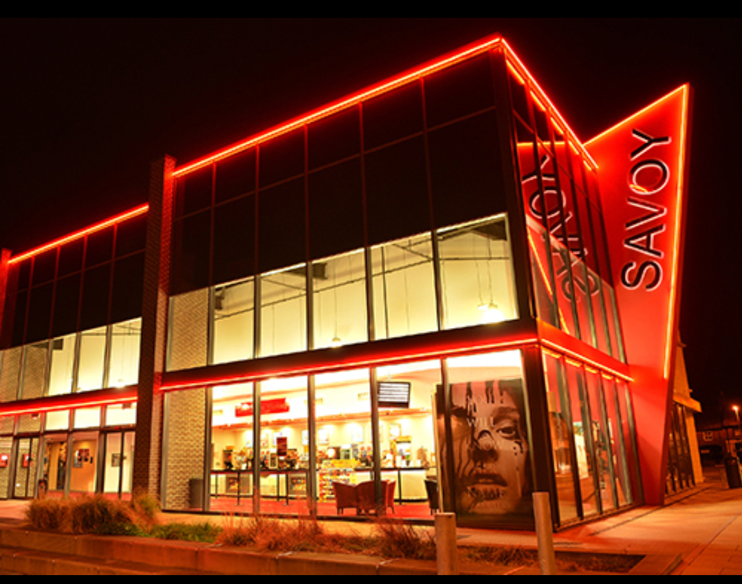
I have been using references to help me with my work. Hopefully this will impress my client (who is coming all the way from Nottinghamshire .
The Savoy cinema,
And Worksop library ,
I will be using these photos as a guide as to some main features of Worksop (Bassetlaw).


life drawing Pt.2

I feel that my newest Real life drawing lacked the detail I usally put in my work.I did not finish the ribcage.One thing I am impressed with is the facial features.
I used slight shading on the back and face.my next target is to try focus on ribcage and try and draw the curves on the bones. A fellow class mate gave me the iidea to draw shapes for the body and the work on the detail.


We were told to grade(so to speak) another person's work. I picked another class mates 
Drawing. I was impressed by the fact she had managed to draw all parts of the body , even the ribcage, which I would like to be able to do myself.


Monday 10 November 2014

Pt. 3 of Learners Survival guide(Wip)

Using a well known logo to make my own versions.

This is one my final designs that was made using Adobe photo shop and illustrator.
The theme was a dominos menu.I used a fancy font to give it a more adult look and made the back look like a official menu.For my first attempt at a from t i think it went quite well a;though i had some problem with the logo its self.I have used the actual logo for NNC college as requested. In the future i shall have to learn how to import things from different pages.My over all design does feel empty ,but as i said before, for a first attempt it is not that bad.In the future i will have to work on
my skills using Photoshop.

On the bottom of the booklet i have included the contact information e.g email address,phone number,and website.
This was a drawing i did for another idea for the LSG booklet design.I thought it would relate to this idea as they are both on the same lines of "food products".I have changed the writing from the original text to things i find positive about NNC(North Notts college).
I shall be colouring this design up later(maybe in a red colour like the north notts colours).

Saturday 8 November 2014

Sheffield Museum and Art

As a trip to Sheffield was way overdue,Me and my farther decided to go and were lucky enough to stumble up on Sheffields Arts and Crafts fair.
while searching around one stall caught my attention.A lady selling both Cards and colouring books that automatically stood out to me. I unfortunately could not get any pictures of her work but found it very impersonating on my own.The range of colours she used gave me many ideas with multiple projects I am currently doing at the moment
(I will try to link a picture down below).The rest of the arts and Crafts fair broadcasted a wide variety of talents some using textiles,others using paints.
unfortunately the museam it's self seemed to be lacking in expeditions.Maybe due to rearrangement. The day it's self has taught me that it is always a good idea to go out and look at other artists(even discus with them about their work).
Cheers to a enlightening day At The Sheffield Museum.

Wednesday 5 November 2014

Sculpture work with fruit

As part of my project ,to make a sculpture out of multiple materials,I decided I would make it out of wire and paper mache.I personally think this would be easier to make a face with.My idea is to use artist Givseppe Arcimboldos idea of replacing main features of the face,like eyes and nose, with fruit.My idea is to use both salad and vegetables on the face to represent the saying 'fruit is good for the body' .
This is my general idea which I plan to adapt