Saturday, 12 September 2015

box making examples

This was my first attempt at making a small and flat base from my own knowledge.As expected it didn't work out and would not be able to support any product.As seen on the picture above i had expressed the measurements of the product.I shall not be using this layout but it has given me a few ideas to avoid in the future.

This is the final product,Also i should not that they was next to no room for the flaps so the product was stiff when i tried to fold it,


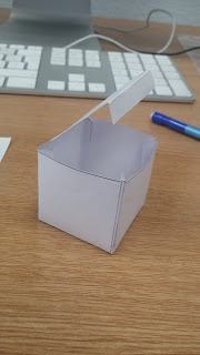
My second attempt was a more simple cube.I personally don't see this working for me as the packaging i have decided to use should be longer and thinner.I can see how a cube would be more cost effective as it would be easy to stack and east to carry around.

This was the final result.
From this layout i drew i have made a to scale one on Adobe illustrator.This one is more accurate and has square flaps then planned.I may have to cut a more circular shape into them.Here is the up to date template:
I will be printing this out and cutting it into shape to see if this will work.I have higher hope then i did with the last products as i have personally checked the measurements and have also worked with illustrator more closely.


Thursday, 10 September 2015

1914

The war in 1914 finished in 1918.
avant garde
  1. The avant-garde (from French, "advance guard" or "vanguard", literally "fore-guard") are people or works that are experimental or innovative, particularly with respect to art, culture, and politics.*
    *Taken from wikapeida 
    Was one of the most influncele trigger for how we do both art and media(music).

    1. Hugo Ball
      Author
    2. Hugo Ball was a German author, poet and one of the leading Dada artists
      is involvement with the Dada movement lasted approximately two years. He then worked for a short period as a journalist, for Freie Zeitung in Bern. After returning to Catholicism in July 1920, Ball retired to the canton of Ticino where he lived a religious and relatively poor life. He contributed to the journal "Hochland" during this time.He died in Sant'AbbondioSwitzerland of stomach cancer on September 14, 1927

      The founding of the Cabaret Voltaire was the beginning of dada ZurichSwitzerland. It was founded by Hugo Ball, with his companion Emmy Hennings on February 5, 1916 as a cabaret for artistic and political purposes. Other founding members were Marcel JancoRichard HuelsenbeckTristan Tzara, and Sophie Taeuber-Arp and Jean Arp. Events at the cabaret proved pivotal in the founding of the anarchic art movement known as Dada
      The urinal 
      :
      Fountain is a 1917 work produced by Marcel Duchamp. The piece was a porcelain urinal, which was signed "R.Mutt" and titled Fountain. Submitted for the exhibition of the Society of Independent Artists, in 1917, the first annual exhibition by the Society to be staged at The Grand Central Palace in New York, Fountain was rejected by the committee, even though the rules stated that all works would be accepted from artists who paid the fee. Fountain was displayed and photographed at Alfred Stieglitz's studio, and the photo published in The Blind Man, but the original has been lost.

      Elsa von Freytag-Loringhoven


Tuesday, 8 September 2015

Animal product fonts/Possible box layouts research

I decide to look for animal product fonts.This would given me a idea of what type.of fonts would be appropriate for a animal products. Some of these examples include:
I found this product very unique.A soap(shampoo soap) in a box with very generic but useful fonts.This product gave a animal friendly vibe in my opinion.I love the sketchy paw print on the side which is quite cute.I can imagein this product is cost effective as it is quite simple looking.I may attempt to use this in my product some how(It would be quite simple as well).

This product is very different,For a start its in a bottle container and has a pump action.
The general product design is simple though like this product i have noticed the trend in having animal characters(in this case it would be the cat).This is by far one of the easiest ways to identify the product.The logos and fonts are simple but serve their purpose.If i was to take ideas from this design it would cut out the need for making a box,though this would create the problem of making a bottle(i could try and find one around the house).

On a separate note i looked around for possible box layouts(or ideas for how i will fit my pet product into something ).Here are my favourite ideas:
This one kind of resembles i happy meal box(made by Mc Donald's) or maybe a Take away carrier.By having handles this product is made easier to carry and there for will be more effective.
I could make this out of cardboard or strong paper.I could even give this box little decorations.
My thought is to give the top of the box a stamp(a company one).

some examples of my box ideas are these sketches:
This one was taken from a simple box(water proof plasters )and was used to help me with my measurements)I recreated it on Adobe and scaled it so it could fit my product.
Above is the box i used as a sample.As you can see all the measurements for all the sides are written where needed.

Another idea i had for a box design was a lunchbox(or Mc Donalds) type box.
this idea went well but would not have looked as good with my final product.


Metamorphosis UNIT 82(research)

For unit 82 we are to learn about the poetry Metamorphosis. Below is the exact meaning I found explaining the meaning of the word.

Visual Metamorphosis

Visual metamorphosis is the term we use to indicate shape-shifting in art. It allows an artist to transform a shape representing one item into a similar shape representing something else. This, in turn, allows one meaning to be hidden behind another. It is a visual technique equivalent to allegory and metaphor in literature and has, in consequence, been widely used. It was first proposed in the 1930’s in a slightly different form by the French art historian, Henri Foçillon. Although subsequent historians have recognized visual metamorphosis in a few works by major artists, Dürer being the best-known, it has been far more widely used than anyone, save artists, has ever recognized.*
*Taken from the website:http://www.everypainterpaintshimself.com/theme/visual_metamorphosis
 
One of the main contributers to Metamorphosis is Titian who painted a series of pictures for the subject.
His first one was this:
 
The actual meaning behind the picture was that Actaeon had walked in on Diana
bathing. From then we were given a option of either he had walked in on her  in a cave and while he was hunting intentionally or it was a mere accident. From then on Diana decide to get revenge on him by turning him into a deer and setting her dogs on him. The picture below tells the tale:
(this picture was titled 'The death of Actaeon')
This picture is seen as more violent. Also the subject of why one of Diana's breasts is fully exposed is thought of in two ways. One that the picture expresses the way that women are objectified and how revealing her breast would be unneeded . Another view was that She is supposed to chast and was known as 'Diana the goddess of hunt, moon , and childbirth '.she has a cresent moon on her head that means her status.
You can see this as a physical performance below:
Though this performance gives Diana a more temptress attitude (even though this is incorrect).a unique collaboration with The Royal Ballet, with this re-imagining of the Diana myth. Produced by Credit Suisse.
Also there has been a current sculpture made by Conrad shawcross


The pictures above are a example of his work done on this subject. The illusion above was set in a black box .The box itself had little peep holes with blinds just obstructing vision. Inside the box(if you were able to get a glance) was a girl named Diana who would be going through her beauty routine. The peep holes themselves were just a bit out of reach so the person would have to stretch to see inside.
below is a example of what could be seen inside:


Monday, 7 September 2015

examples of Famous company logos

Some examples I have found while looking around for different company logos.
Below are just few that can be seen around the world and are well known and easily recognizable:
Above we see famous brands like Redbull,Carlsberg, Nestle etc..
These brands are easily seen and you do not have to read the name.
If I was to concentrate on one in particular it would be red bull.
We look at red bull and even without the name it us recognizable.Maily because of the slogan' Red bull gives you wings' which stays in your head. I want to be able to take some ideas from red bull and be able to create both a product and a slogan that stays in some ones head.
Red bull matches its colours together with the actual brand which also gives it recognition.
This gives me ideas of how I should match up the text and colours to give it a professional.

Moving on to more unique kind of packaging (some of which may not be as well know but are still very clever)Some of the products above are:

This design is very similar to the last one but for eggs!
Which is very cute in my opinion.This design is very economical.

This product caught my eye automatically because of how simple it was and how effective it looked. I also thought it was rather cute the way it had been turned into a mini robot.

The last idea I found is one that I would like to use when I do my product idea.
My version would be a cat with ears and the stand Would be little feet(paws).


Monday, 6 July 2015

Template ideas for Worksop bus station


Designs made using adobe illustrater:


Ideas that have been imported onto the wall that we will be decorating.


The design above is my favourite one.


Wednesday, 1 July 2015

final design for wall (unit 34)

Evaluation:
This is my final idea for the wall.This was made using illustrater and using lines and the pen tool.
The idea of this design is that all the people are part of a jigsaw and that they all connect together(as a jigsaw does).I have tried to add as many people as i could so that it would make the work unique as possible.Each person has a different style(just like in real life).I at first thought about adding hair to each person but this would mean that the idea would not fit together(literally).
I also tried to vary the colours of each outfit as much as i could.I really wanted yo avoid the clique of adding different skin colours.I feel that some times it comes a cross as obvious that different skin colours and races are added so that a person will not be criticised.
I generally enjoyed this unit a bit more then others.Maybe because i had more ideas from the start.


here is a close up of some of the design.This focus on a few people.

Clients view: