
A very cheeky advertisement that made me laugh.A very clever way to make a statement that children wouldn't understand and wouldn't offend anyone.
Other images compositions are as such:
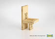
Image quality is apauling but couldn't find any other image of this exact thing.
The set up of this image is smart and simple.Using their own brand as a set up ,to me, is a good idea.
Moving on to the more colourful compositions of advertising and poster:

This images use colour association.For the first one the royal red would mean it is higher class and that the furniture is inside.While the blue could represent the bathroom or sky.
My last image is more for the great pun idea which,for me,is a automatic attention grabber.The wit makes it all the better;

No comments:
Post a Comment