
My first impression is how wide the fonts are compared to all the others I have looked at. They give off a more dramatic effect. And the way the characters are squared off gives it quite a 'Vintage' effect as well. This will link into one of my pieces as I will try to use boxes (layout) in my work .
I thought that in the far left corner I could put 'A frightfully good college!' to stick with the dramatic theme. I will continue my research for now and continue to experiment with different ideas.
Other examples of Hitchcock poster(and movie style compositions) i found were:

As i am not that familiar with this film by Alfred Hitchcock but i really like this composition.
Mostly because it looks very abstract and simple.The eyeball does not to much of the picture up and gives a sense of mystery to what the film may be about.The colour system also looks appealing.
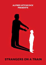
As i have watched this movie i can easily understand why the maker of this picture has been set out like it has.I love the way that the shadow in the background stands out against the harsh red colour.Also the use of all three colours is very nice.The fonts used are very simple.

This poster is very different from the others are it strays away from the abstract,simple ideas.This poster uses actual pictures from the movies and combines them with a simple movie poster layout.
There is a range of different texts used in this as well.The colours used range from stained coffee paper(i think)to a calm yellow which gives the layout a boost.
No comments:
Post a Comment