When using clay you must:
.Not through it at other.
.Ingest
.You must remember to wash your hands afterwards.
.Avoid slipping on it and if this occurs clean it up and warn other around you
.Bring spare clothes( if necessary ).
When using Wire you must:
.wear protective gloves that are provided.
.Wear goggles at all times to avoid being poked in the eye with wire.
.If using wire mesh, Make sure you press it against the table so you do not get hit when it springs back.
( Remember when using any materiel in art to treat it with respect and the people around you to ensure safety).
Thursday, 30 October 2014
Pt.2 of NNC Learners Survival Guide
Continuing on the idea of using old posters I looked up classics like Psycho and found a layout that would be suitable for the Learners survival Guide.


My first impression is how wide the fonts are compared to all the others I have looked at. They give off a more dramatic effect. And the way the characters are squared off gives it quite a 'Vintage' effect as well. This will link into one of my pieces as I will try to use boxes (layout) in my work .
I thought that in the far left corner I could put 'A frightfully good college!' to stick with the dramatic theme. I will continue my research for now and continue to experiment with different ideas.
Other examples of Hitchcock poster(and movie style compositions) i found were:
As i am not that familiar with this film by Alfred Hitchcock but i really like this composition.
Mostly because it looks very abstract and simple.The eyeball does not to much of the picture up and gives a sense of mystery to what the film may be about.The colour system also looks appealing.
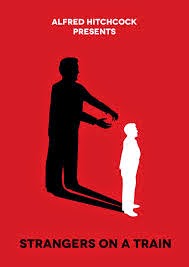
As i have watched this movie i can easily understand why the maker of this picture has been set out like it has.I love the way that the shadow in the background stands out against the harsh red colour.Also the use of all three colours is very nice.The fonts used are very simple.
This poster is very different from the others are it strays away from the abstract,simple ideas.This poster uses actual pictures from the movies and combines them with a simple movie poster layout.
There is a range of different texts used in this as well.The colours used range from stained coffee paper(i think)to a calm yellow which gives the layout a boost.
NNC Learners survival guide work.
While researching ideas for the front of my Learners survival guide I came the idea to use the template of old movie posters, I searched for templates and came across a artist named 'Peter strain'( unforantly I could not but a link to his page]
whose artwork mixed interesting fonts and his own stylised versions of movies as seen below:
 This piece interested me because of the way it made up the face.Also how the landscape behind the figure is normal which i quite like.My favourite part about the picture is the stars behind the picture which gives the picture a interesting look.
 As this is from one of my favourite movies this one automatically grabbed my attention.
I love the way the back ground is made up of words(which are actually from one of the songs in the movie).The fonts used on this picture is also quite interesting.

whose artwork mixed interesting fonts and his own stylised versions of movies as seen below:
I love the way the back ground is made up of words(which are actually from one of the songs in the movie).The fonts used on this picture is also quite interesting.
The final picture that caught my eye was this one(which is very much like the first picture in the way it partly has writing).Generally this picture is something too consider in my future work with the LSG.
When I saw these it gave me the idea to use fonts to maybe make a whole picture. These words could be ones that come to mind when you think of college. For example 'Art' and 'friends' simple words.
Also the colour schemes on the pictures above has lead me to think that I should try include darker colours in my own work. All these ideas will be put into one of three of my designs. After which I will decide on my final one.
Subscribe to:
Comments (Atom)